A mobile app for hospital consult requests
A two-sided mobile product that connects the clinician raising a consult with the specialist who answers it
The client is a hospital network, kept anonymous here. Built on ServiceNow's Now/Horizon design system.
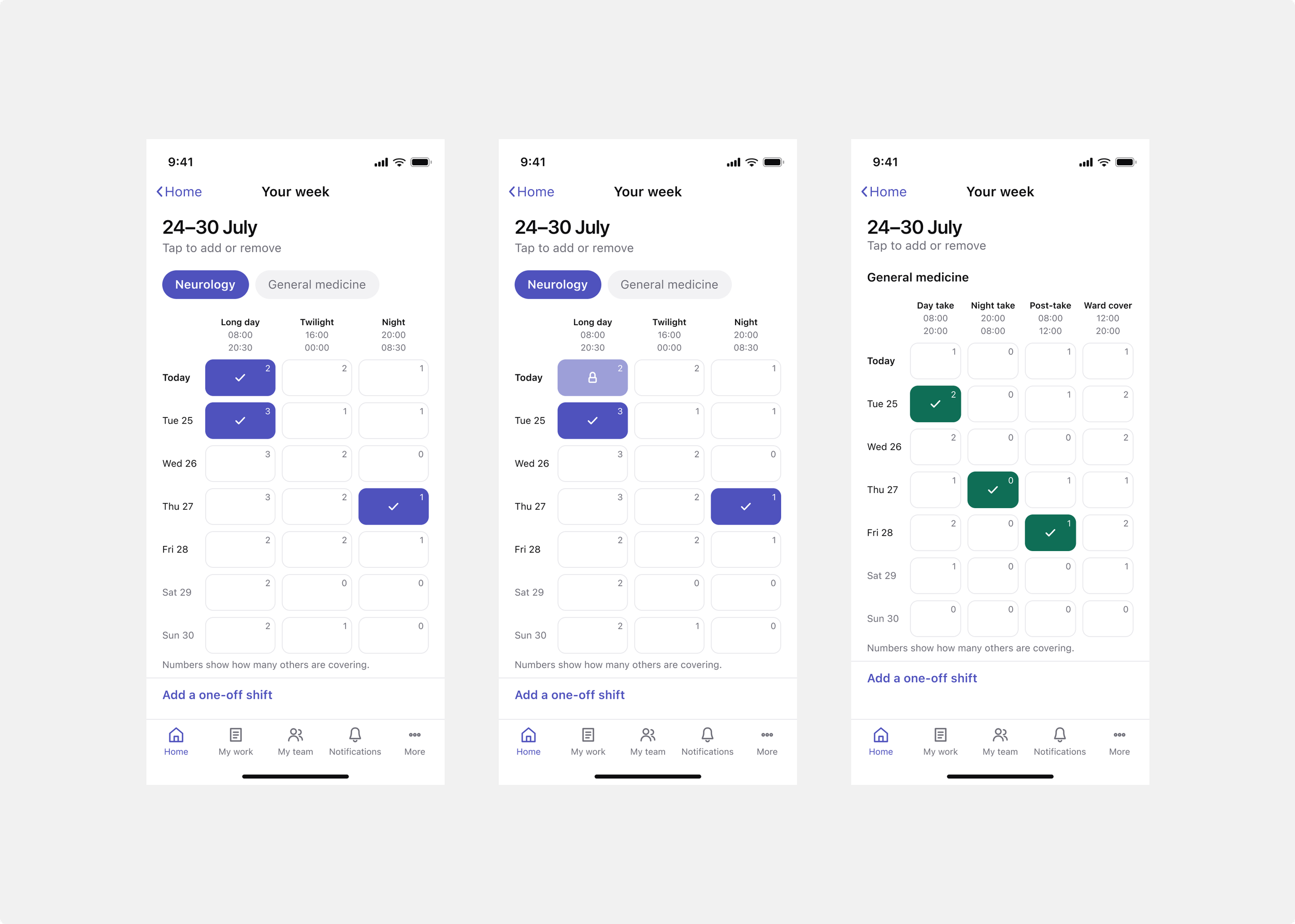
The specialist's week. Each row is a day, each column a shift, and tapping a cell declares that you're on. The number in each cell shows how many other people are already covering that shift.
Snapshot
Sector: Healthcare (a hospital network)
My role: Lead designer, end to end
Team: Strategist, solution architect, engineer, and me as sole designer
Platform: ServiceNow, delivered as a mobile app for clinicians and specialists and a workspace for team leads, built on the platform's on-call scheduling and analytics
What I did: interviews and current-state mapping, collaborated on the service blueprint, mapped the journey, prototyping, evaluative testing, and the full mobile UI.
In a hospital, a referring clinician often needs a specialist's opinion on a patient. That request, a consult, used to go through the switchboard: phone calls, paging, and calling back when no one picked up. The hospital asked us to replace it with an app. The result is one product used by three people. A specialist declares which shifts they're covering, a clinician raises a consult against that availability, and the specialist is notified, accepts it, sees the patient, and records the outcome. Behind them, a team lead monitors workload and sets how a request escalates when no one responds. The clinician and specialist share one view of the request and work on it in their own time, rather than by phone. It's mobile-first, because both are moving around a hospital. The work went into implementation and was scoped as an app.
The problem
At its core this was a communication problem: a consult is one clinician asking another for help with a patient, and there was no good way to do it. Requests went through the switchboard and then by phone, and when that fell short, through workarounds like text messages and chat apps. Discovery surfaced six pain points that hang together. It was hard for specialists to prioritise, because no one could see all the requests at once. The data was unstructured, because a phone call has no required fields. There was no traceability or single source of truth, so no one could see where a request was up to. And there was no way to hold an asynchronous back-and-forth, so the to and fro was slow and easily lost. Underneath all of it was the same thing: a clinician on a phone chasing a specialist who might not answer, and starting again when they didn't. That was time neither clinician spent with patients. The job was to give both sides a direct, structured, visible way to communicate, and to make a request reach someone reliably without a person in the middle chasing it.
My role
I was the only designer on the project, working with a strategist, a solution architect and an engineer. I took part in the discovery sessions and the workshops with clinical staff, around fourteen participants across the clinical departments and the digital team, and worked on the current-state map and the service blueprint. I mapped the future-state journey across the three roles, then designed everything after it: the prototypes, the testing, and the full mobile UI, all mobile-first.
The design problems
There were three. The product had three roles with different needs, a specialist declaring availability, a clinician raising a request, and a team lead overseeing it, and each had to find it quick and clear. Everything had to work on a phone, in a hospital, where people act in short moments between other things. And a request had to reach a specialist reliably and stay visible the whole way, so the chasing and guesswork the switchboard involved were gone.
Decisions and trade-offs
One product, two sides. The specialist who declares availability and the one who answers requests are the same person, so the app is one product facing two directions rather than two separate apps. The clinician and specialist also share one view of the request and communicate on it in their own time: the specialist responds when they can, instead of both needing to be on a call at once. That shared, asynchronous view is what takes the phone tag out of the process.
Declare, don't assume. The specialist sets their own availability each week by hand. The app doesn't guess who's on from rosters or past weeks, because that data isn't always right and a wrong guess sends a request to someone who isn't there. It's a little more effort, but it keeps the product honest about what it actually knows.
A grid, not a wizard. Availability is a week grid: days down one side, shifts across the top, tap a cell to declare you're on. You see the whole week at once and toggle, rather than stepping through questions one screen at a time. It's faster for something done every week, and it fits on a phone even with the app's navigation around it.
Show coverage as a number, not a warning. Each cell shows how many others are already covering that shift, as a plain number, even at zero. It's information, not an alarm. The one place the app warns is when removing a shift would leave it uncovered, and because warnings appear nowhere else, that one means something.
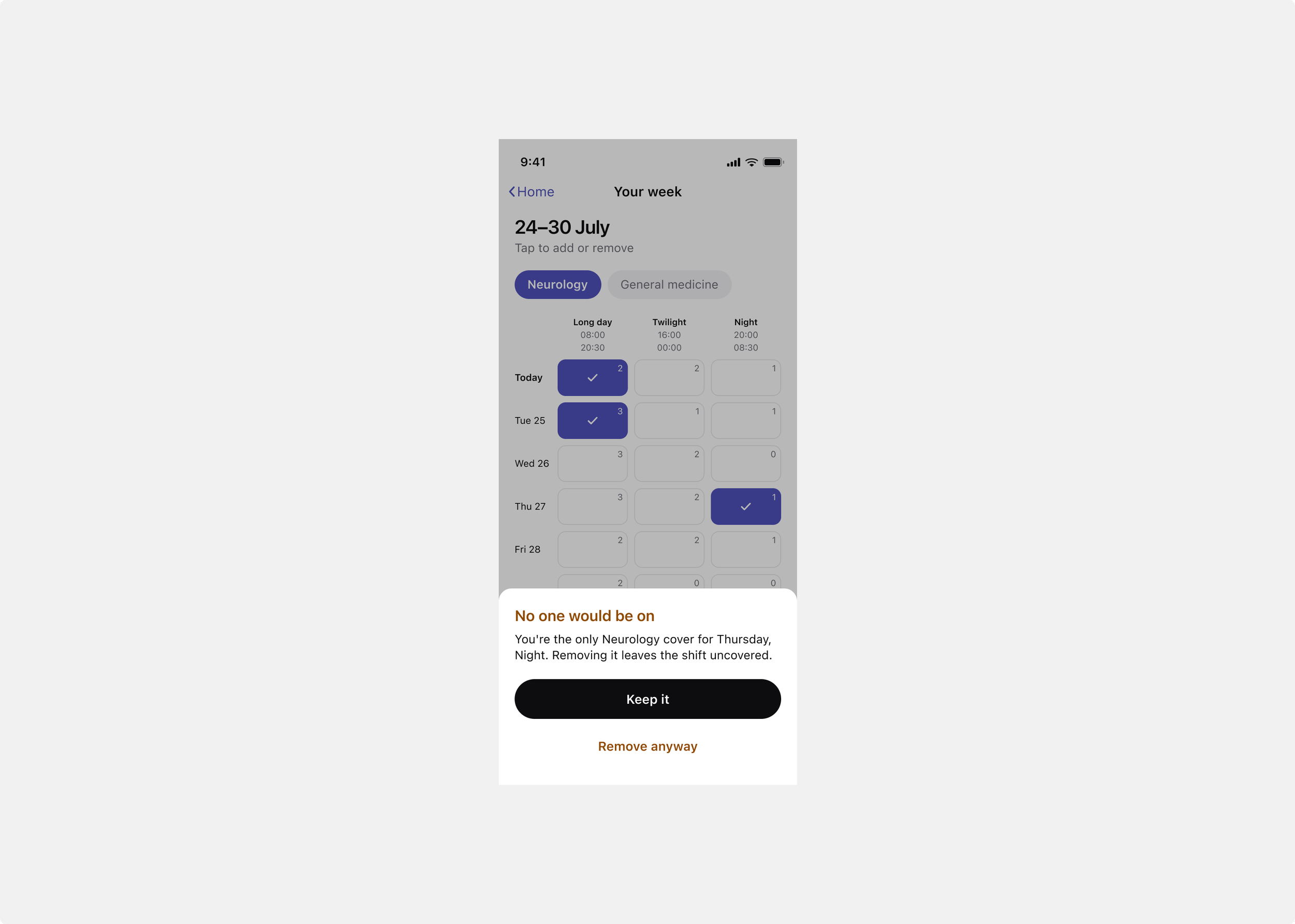
The one warning in the app. Removing a shift that would leave no one covering it prompts a check first.
Escalation set per specialty, not fixed. When a specialist doesn't respond, the request escalates on its own, to the next person on call, then to a manager, on a timed plan. Because specialties run differently, the team lead configures those steps for their own specialty rather than everyone sharing one fixed process. Each request carries its own plan, logged as it runs, so anyone can see who was notified, when, and who accepted. This is what replaces the switchboard's chasing, and it makes the process traceable.
Mobile-first, for people who are moving. Both clinicians use this between other tasks, often on a ward, so every part is built for a phone and for speed. Raising a request, being notified, accepting, and recording an outcome are all short, direct actions.
The solution
The app has two sides that meet at one person, with a team lead behind them keeping the process reliable.
The specialist side is where a specialist declares the shifts they're covering. The week grid is the whole of it: days down the side, shifts across the top, tap to declare you're on, and a number in each cell showing how many others already are. Changes are held as pending until saved, so declaring a week is one considered action. The grid also handles the cases that matter: an empty week, a first week with no history, and the removal guard. And it holds real differences between specialties, one runs a different shift structure from another, rather than just relabelling the columns.
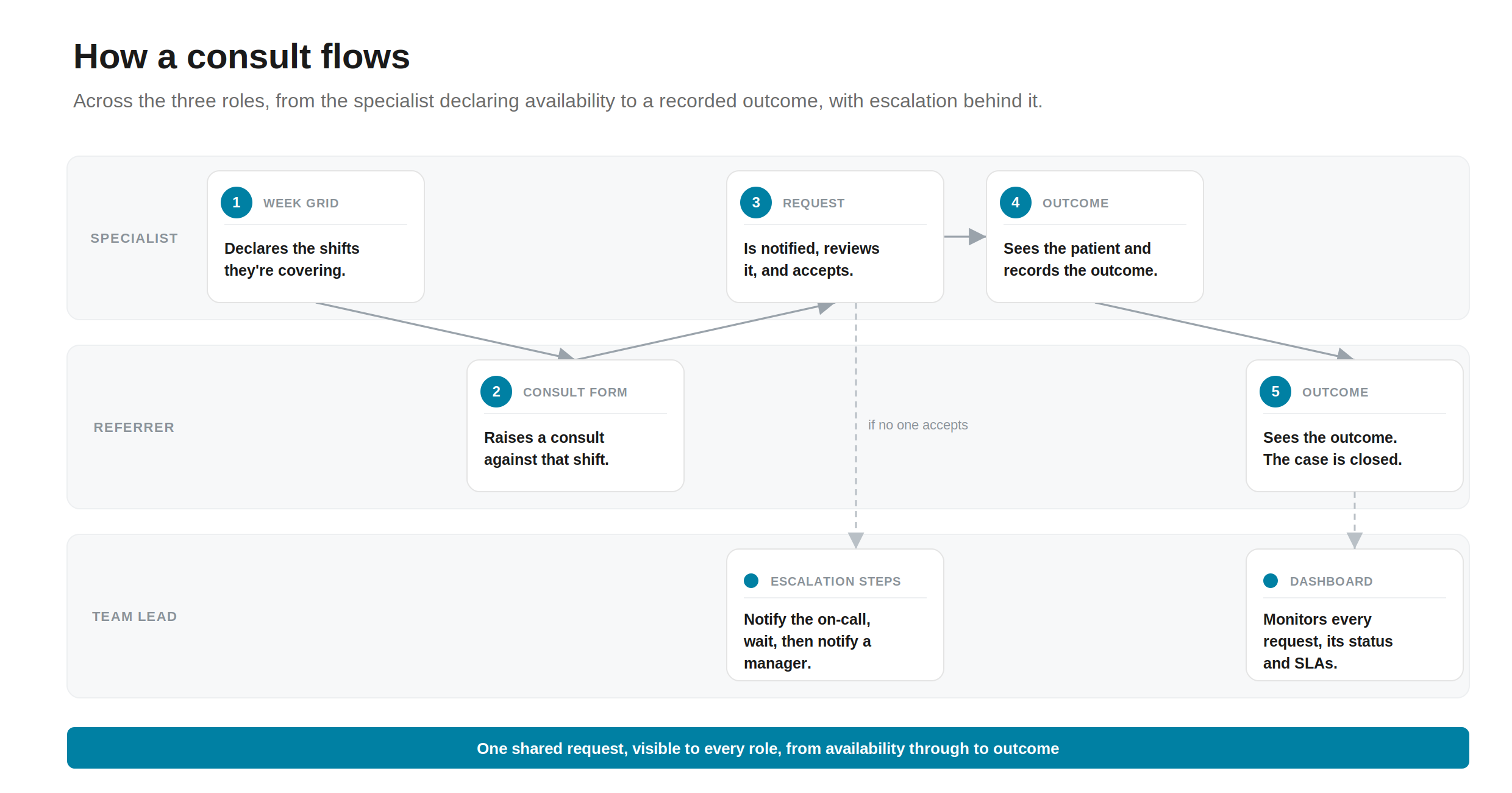
How a consult flows. The specialist declares availability, the clinician raises a request against it, and it passes back to the specialist to accept, see the patient, and record the outcome, on one shared request both sides can see.
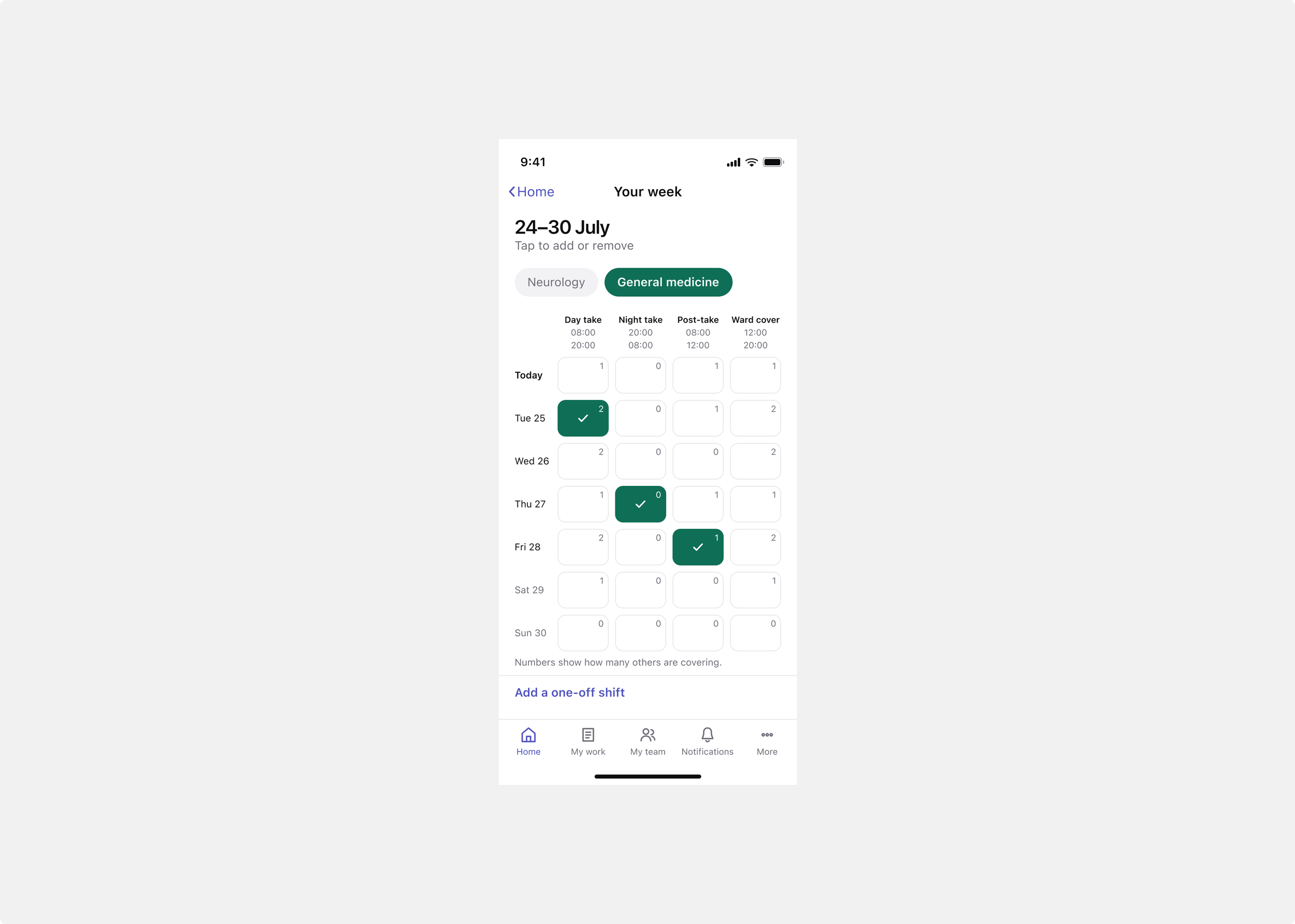
A second specialty with a different shift structure. The same grid holds real differences between specialties, not just different labels.
The referrer side is where a clinician raises a consult and follows it to an outcome. The home screen shows their requests, a search, and quick actions. Raising a consult is a short form: find the patient, choose the specialty, answer a few clinical questions, describe the problem, and submit, with a direct call option for anything urgent. Because the form gathers structured, validated inputs, what reaches the specialist is complete, rather than whatever came up on a call. From there the request has a record with its details, a notes tab, and an outcome. The notes are where the two sides communicate in their own time, visible to both, through to the specialist recording what was decided.
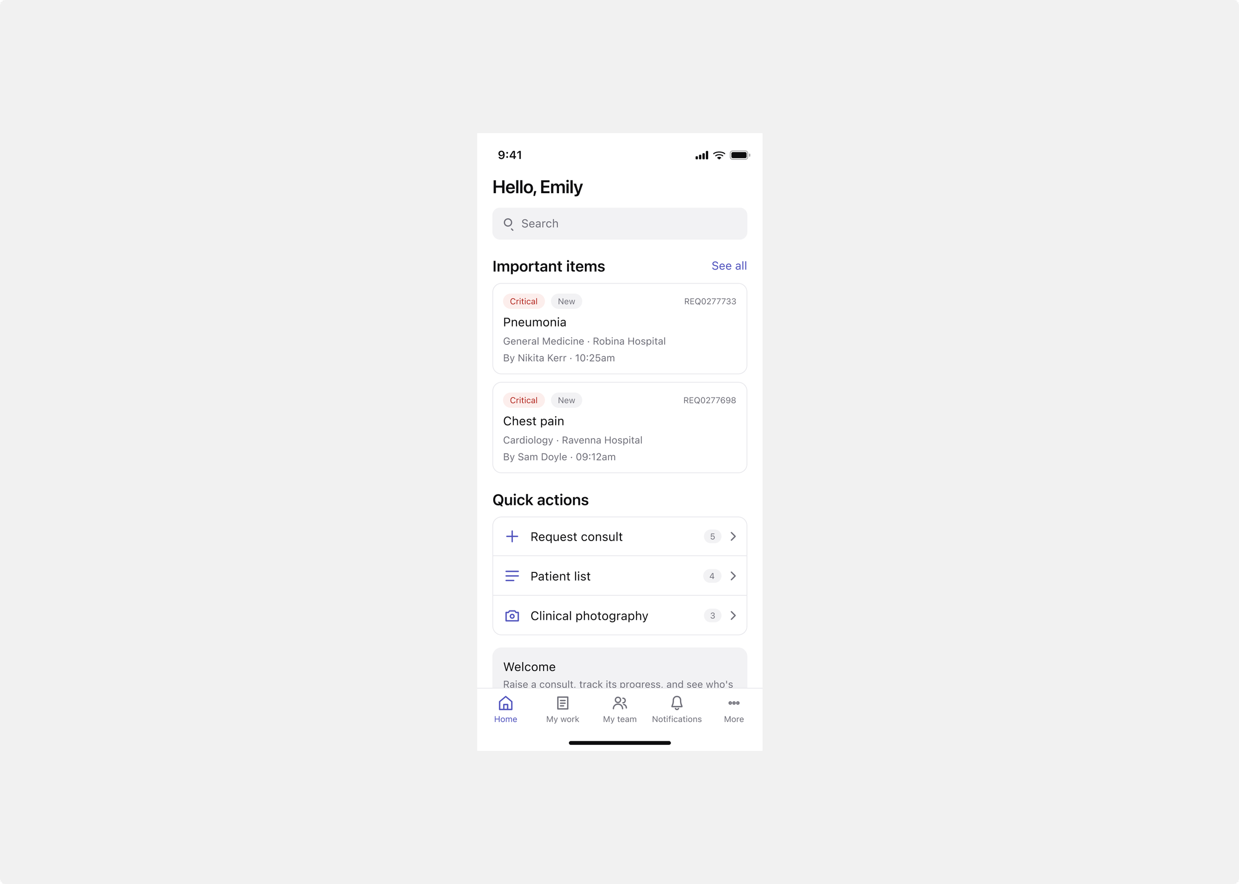
The referrer's home screen: current requests, a search, and quick actions for raising a consult.
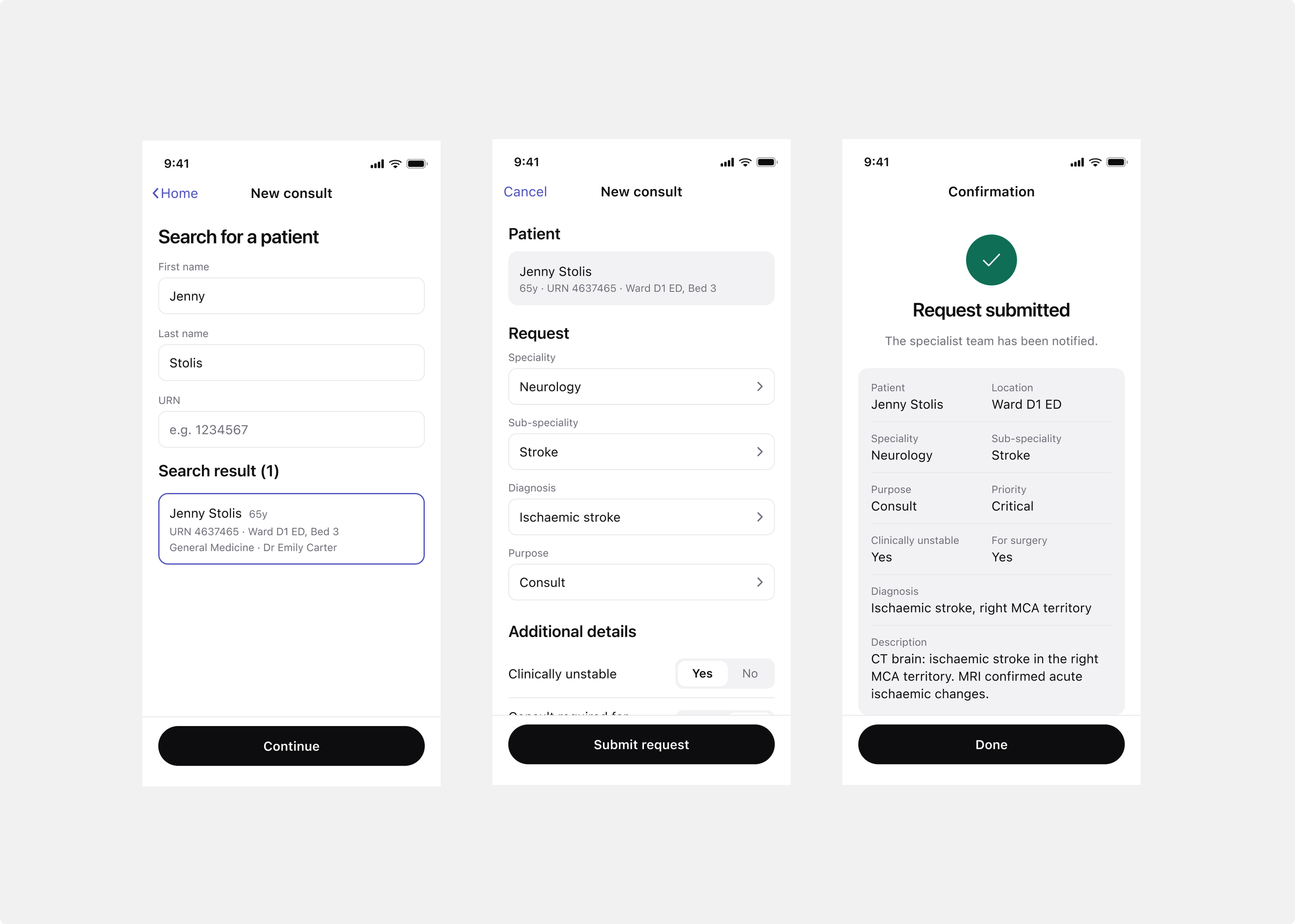
Raising a consult. Find the patient, choose the specialty, answer a few clinical questions, and describe the problem, with a direct call option for anything urgent.
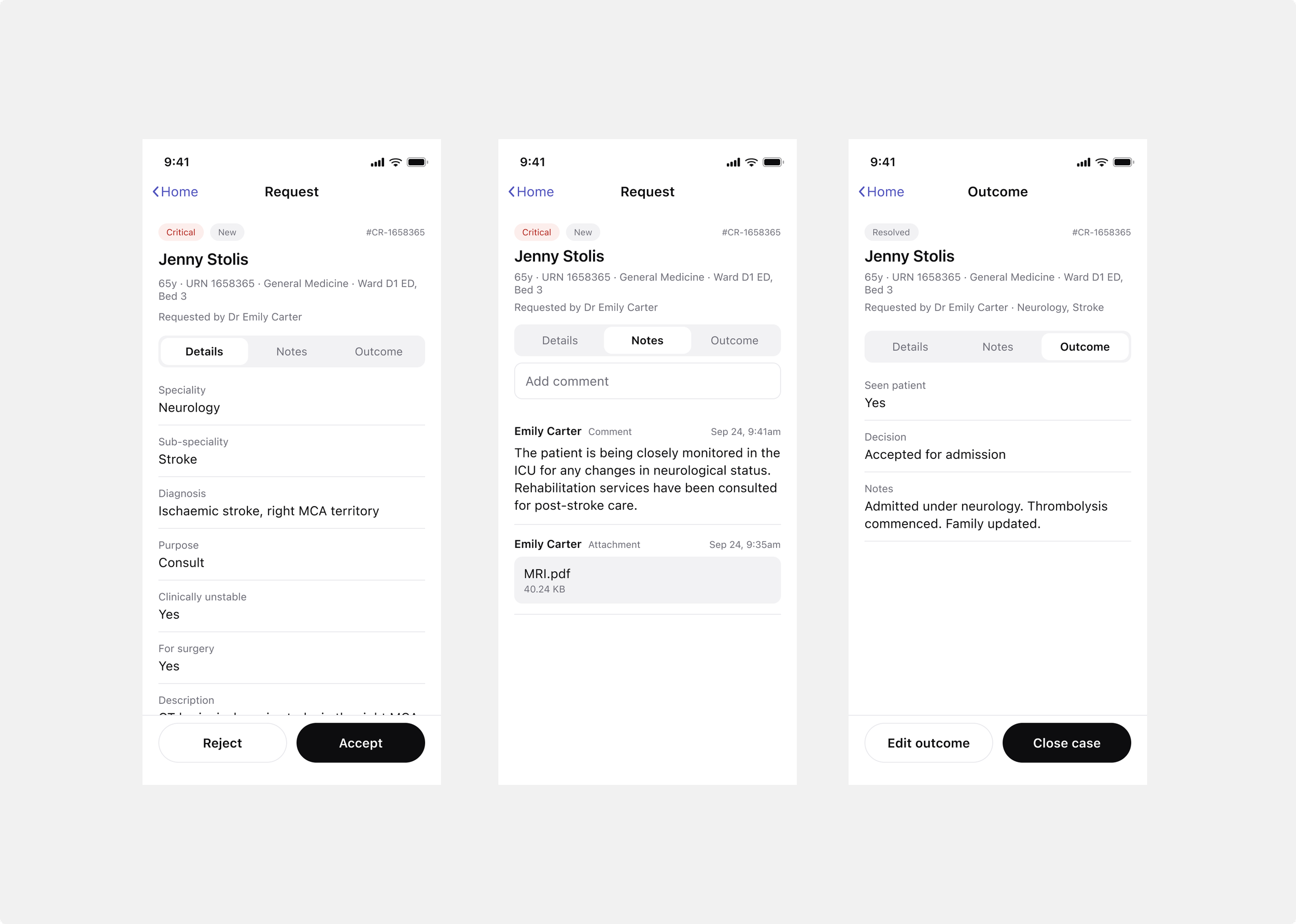
The request record. Both sides see its details, notes and outcome, and use the notes to communicate in their own time.
Seeing and prioritising the work. On the specialist's side, all their incoming requests sit in one list, each showing its priority, which they can change with a swipe. Seeing everything that's waiting in one place, in priority order, is what makes the work possible to manage, instead of reacting to whichever call came in last. It answers the pain point clinicians raised first: that prioritising was hard when nothing showed the whole picture.
The team lead and escalation. Behind the two sides is the team lead, who watches their specialty's workload and sets up how requests escalate. In a workspace, they configure the steps, notify the on-call responders, wait, then notify a manager, each with its own timing. Every request runs against a plan derived from that setup, each notification logged, so it's clear who was contacted, when, and who accepted. If the first person doesn't pick up, the request keeps moving on its own, and everyone can see where it got to. The team lead also has a dashboard, built on the platform's analytics, showing their specialty's requests, SLAs and workload at a glance.
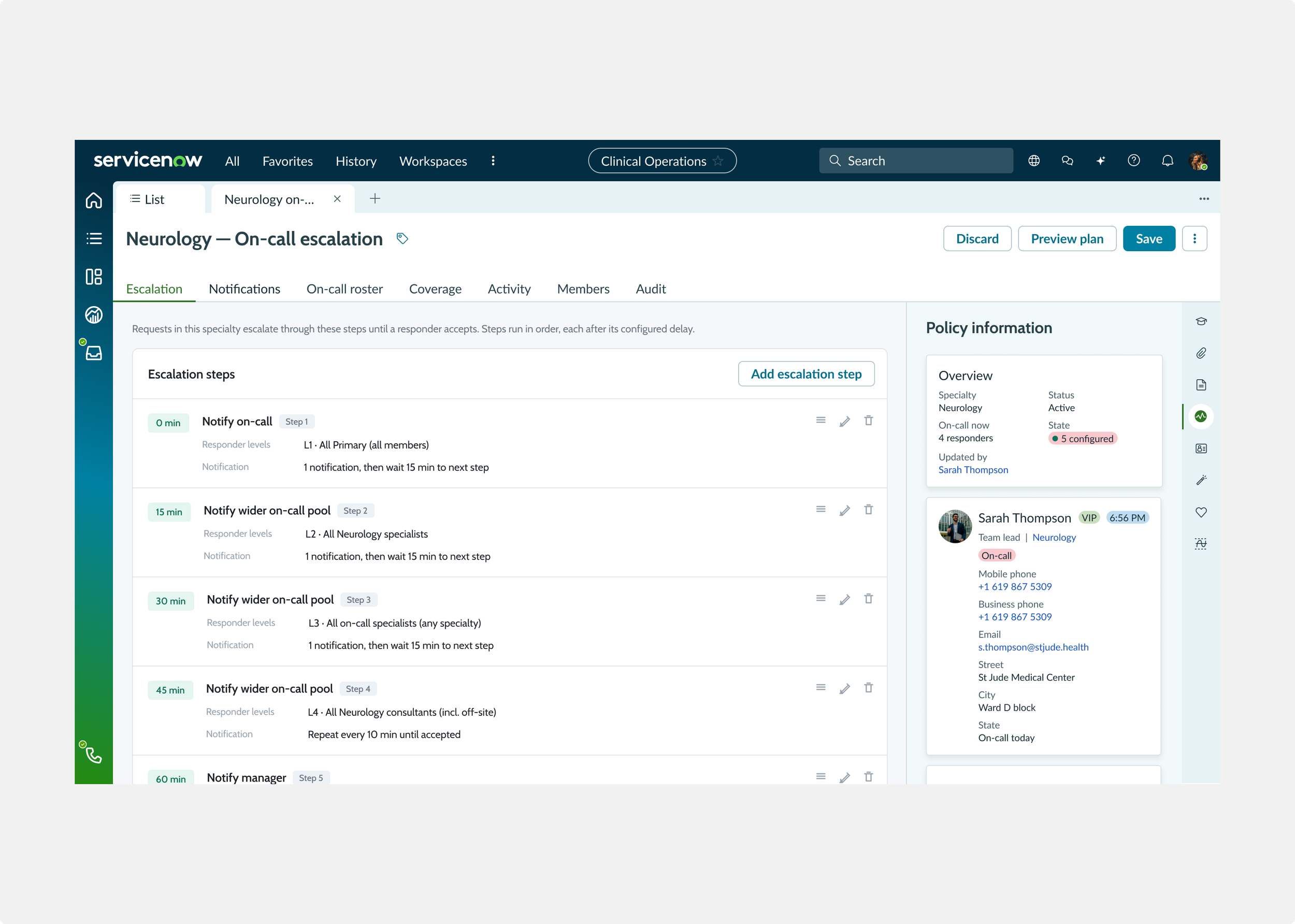
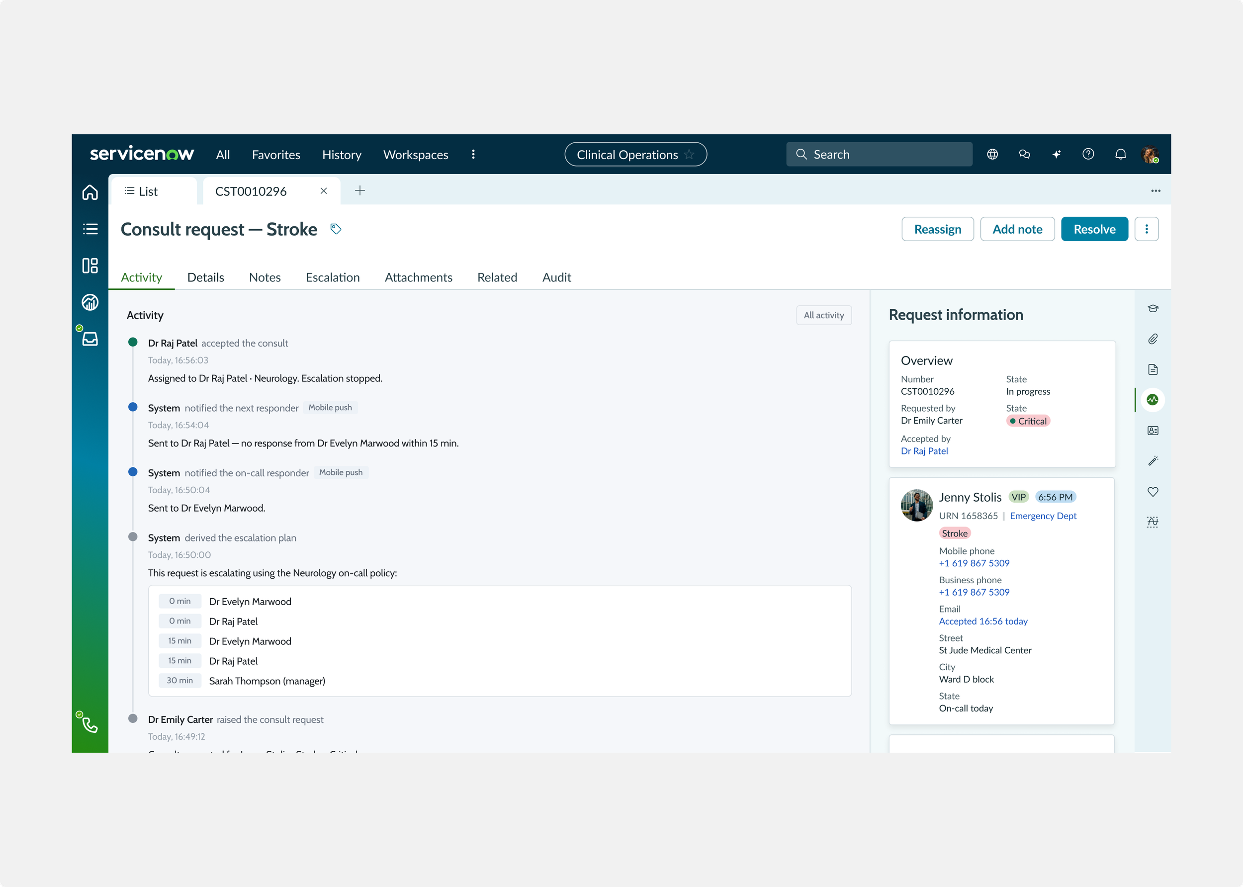
A team lead configures the escalation steps for their specialty. Each request then runs against a plan derived from that setup, logged step by step, so it's clear who was notified and when.
Impact
The app went into implementation and was scoped as a product. It replaced the switchboard with a direct route: a specialist declares availability, a clinician raises a consult against it, and it reaches the specialist, escalating on its own if the first person doesn't respond, through to the patient being seen and the outcome recorded, all visible to both sides.
The engagement projected the change would take about 12.5 minutes off arranging a consult, remove around 13 unplanned phone calls per request, and get a clinician to first contact with a specialist roughly 30 minutes sooner. Those are projected figures from the co-innovation, not measured production numbers, but they point at what the clinicians described: less time chasing consults, and more time with patients. And for the first time, both sides could see where a request was up to, and the process left a trace.
Reflection
The thing I keep from this project is that a two-sided product is only as good as its weaker side. It would have been easy to build a strong request flow for the clinician and leave the specialist a clumsy way to enter availability, or the reverse, but either would have broken the product, because the two sides depend on each other. The specialist declaring availability is what makes the clinician's request land in the right place. So the work was as much about making the quieter side quick and clear as the request itself. Getting both halves to the same standard, on a phone, with a reliable way to escalate when no one answered, is what made the whole thing work.