Agentic employee onboarding
Bringing AI agents into a multi-party workflow without taking control away from the people in it
Client details removed to respect confidentiality. Built on ServiceNow's Horizon design system.
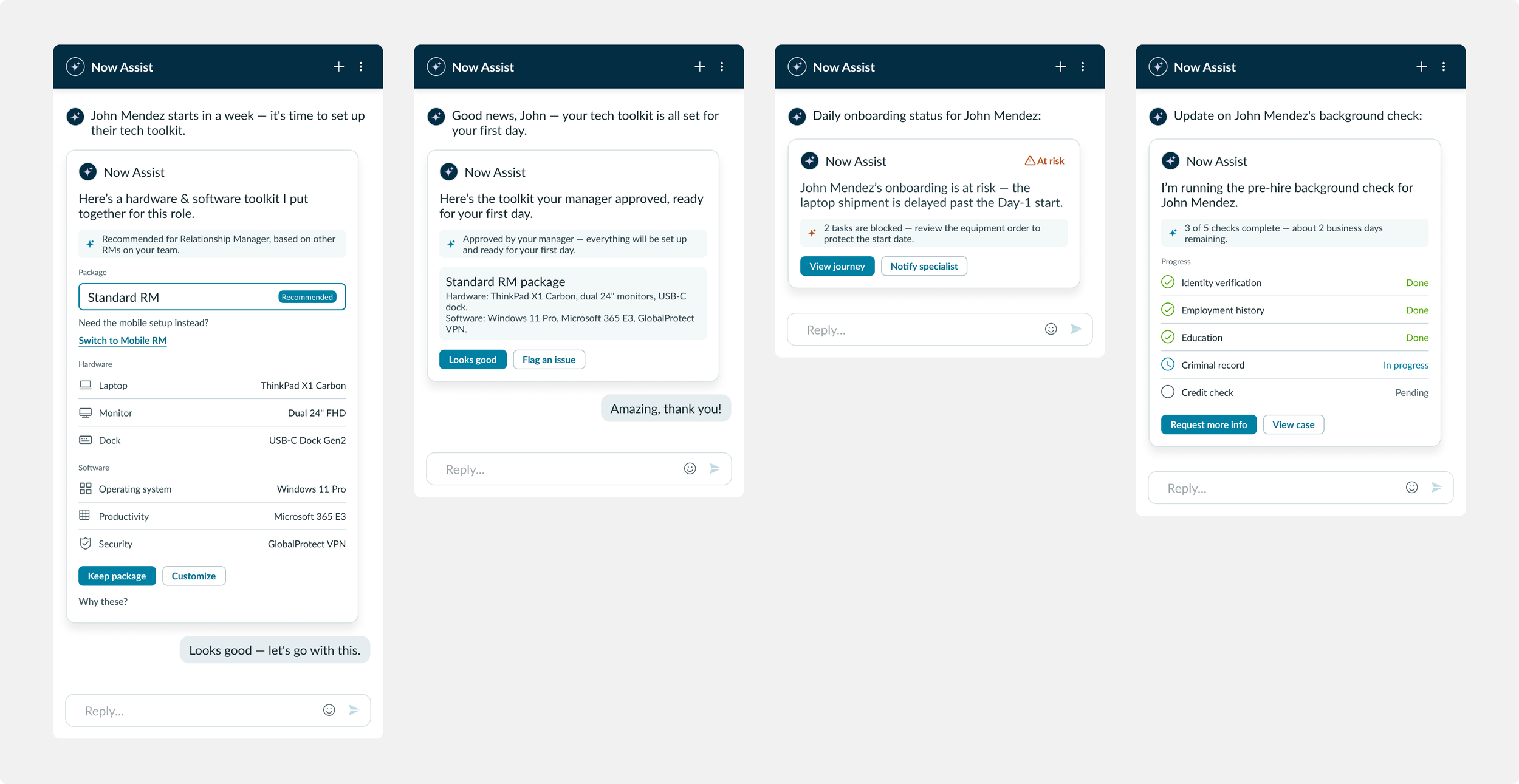
The recommendation card in the Virtual Agent window. It turns what the agent would otherwise return as plain text into a reviewable choice: a recommended equipment package, with the decision left to the hiring manager.
Snapshot
Industry: Financial services (banking)
My role: Lead designer, end to end
Team: Strategist, solution architect, engineer, and me as sole designer
Platform: ServiceNow — HRSD Configurable Workspace, companion mobile app, Virtual Agent
What I did: interviews and current-state mapping, future-state design, storyboarding, prototyping, evaluative testing, and the full UI, including two new components for engineering handoff.
Onboarding a new employee at a large bank involves five people: the new starter, their hiring manager, HR, IT, and an onboarding specialist. None of them could see what the others were doing. The bank asked us to redesign the process with AI agents built into it. The design question underneath that was how much the agents should do on their own, and where a person should still decide. The work went into implementation and was later packaged as a scoped app for other banking customers.
The problem
A start date depends on dozens of separate tasks owned by different people: equipment ordered, accounts set up, training assigned, paperwork completed. When one of them slips, the new hire notices on day one, and the hiring manager, who is accountable for it, usually finds out last.
The bank wanted agents to make this faster. The risk was that an agent which acts on its own is fast, but this process is both personal and regulated, and speed gained by removing people's judgement isn't worth much. So the problem wasn't really automation. It was working out which parts of the process an agent should carry, and which decisions had to stay with a person.
My role
I owned the design end to end, as the only designer in a squad with a strategist, a solution architect and an engineer. I participated in user interviews and the current-state mapping, and in the two-day HCD workshop where we agreed the future state. Everything after that was mine: storyboarding, prototyping, testing with users and iterating, and the full UI for handoff. I designed two new components against the Now design system. The rest of the experience was configured from capabilities the platform already had.
The design problems
There were three. The first was deciding how much authority to give the agents, so they reduced people's workload without taking over decisions that weren't theirs to make. The second was visibility: the old process broke down in the gaps between people, so everyone needed to see where things were up to without asking. The third was how to present an agent's recommendation so it helped the hiring manager decide, instead of deciding for them.
Decisions and trade-offs
Graduated autonomy. The agent's authority scales inversely with the stakes. For low-risk, reversible actions it acts on its own. As the stakes rise, it stops and asks a person. A late task is the clearest example. If an employee misses a deadline, the agent reminds them directly, without asking anyone first, because a reminder is low-risk and easily undone. If the employee doesn't respond, the agent tells the hiring manager rather than deciding what to do next. The manager asks the agent what it suggests, and the agent asks permission before contacting the employee again or escalating further. Each step up the ladder hands a larger decision back to a person.
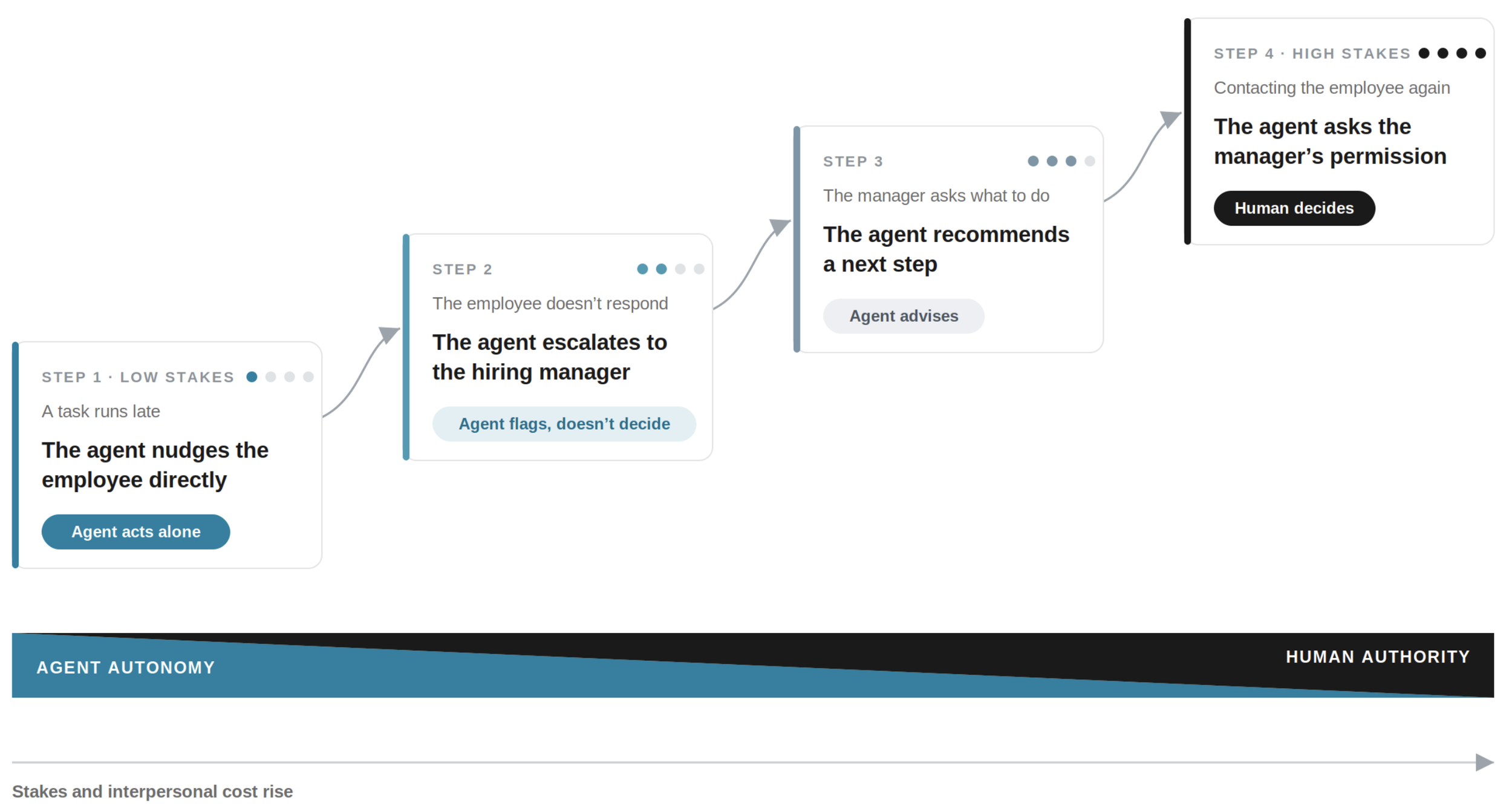
The escalation ladder. The agent handles a late-task reminder on its own, then hands the decision back to a person as the stakes rise.
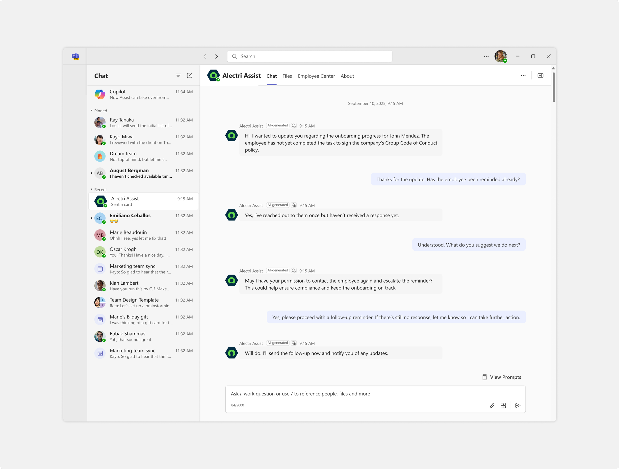
The same escalation in a real conversation. When the employee doesn't respond, the agent brings in the hiring manager and asks permission before acting again.
Only ask when it matters. Keeping people in control usually adds steps, and the risk is that staying in control just becomes more work. So the design only asks for a decision at the points where one genuinely matters. Everywhere else the agent completes the task without interrupting anyone.
Manual or assisted, not forced. In the onboarding portal, the new hire can complete each task themselves or hand it to the agent. Some people prefer to do it, some prefer it done for them, and the design doesn't push either way.
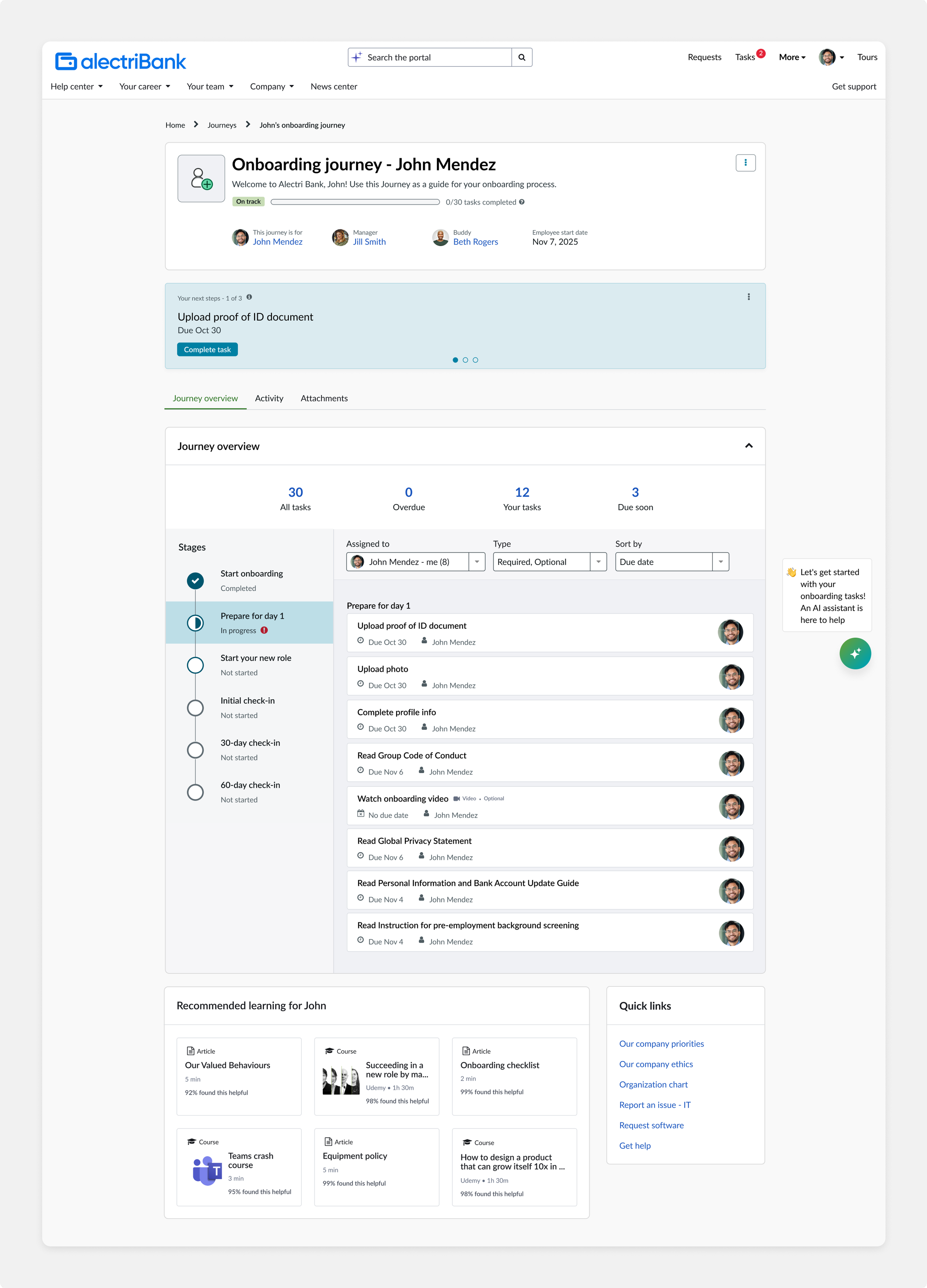
The new hire's onboarding portal. Each task can be completed by hand or handed to the agent.
Each person on the channel they already use. The onboarding specialist works in a desktop workspace, because of how much information they need at once. The new hire starts on desktop as well, then gets access to the mobile app once their first tasks are done, and receives agent updates as push notifications from that point. The hiring manager and the specialist get their updates in Teams, so they can act without opening the workspace, and the workspace remains the place to go for the full picture.
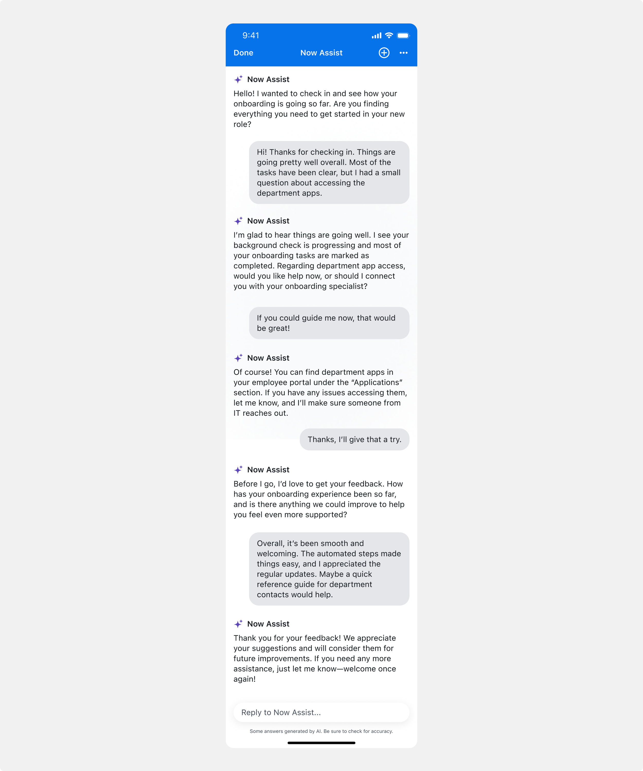
The mobile app becomes available once the new hire's first tasks are done. The agent then checks in at each stage of the process.
The solution
The experience runs across four surfaces. Two components were new, and the rest was configured from what the platform already offered.
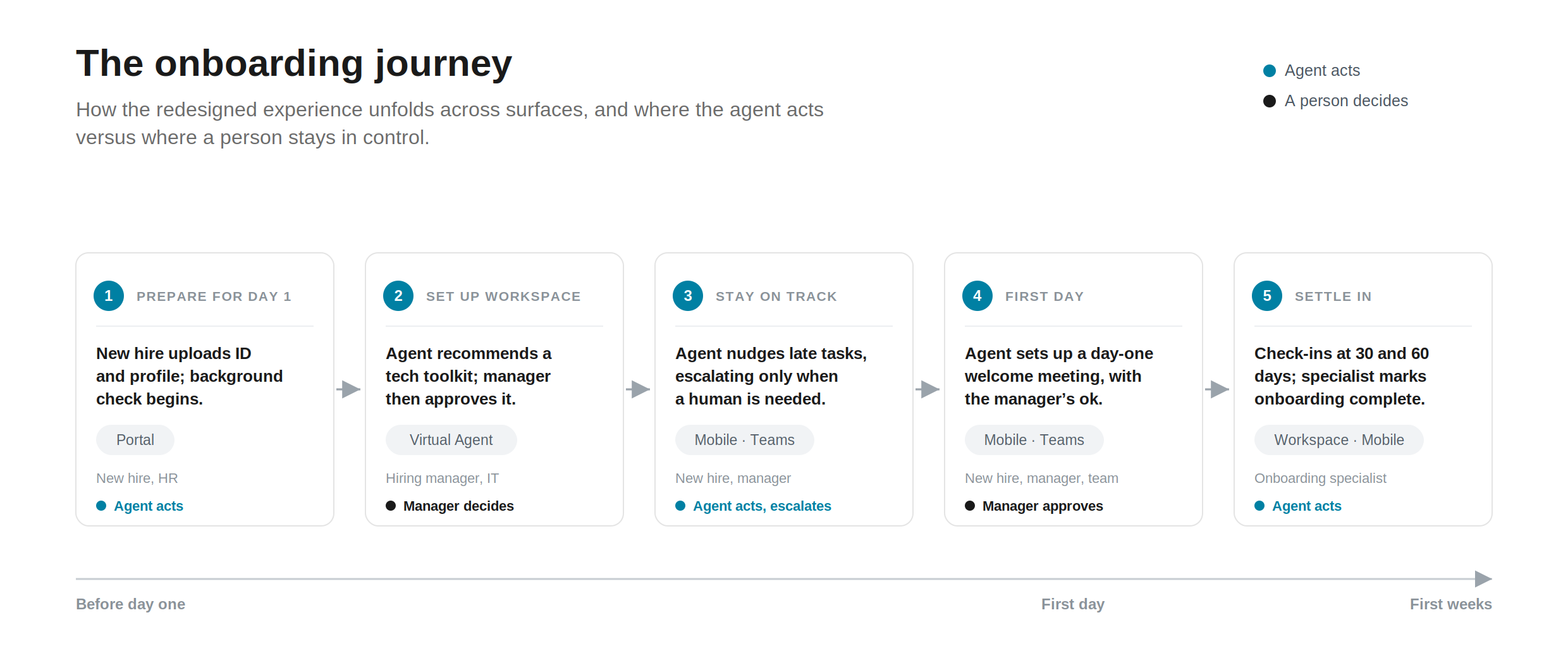
The redesigned process end to end. Each stage shows the surface it runs on and who makes the decision at that point.
The recommendation card sits in the Virtual Agent chat. It takes what an agent would otherwise return as a paragraph of text and turns it into something the hiring manager can review and act on. In this case it recommends a hardware and software package for a new Relationship Manager.
I first built the package choice as three tiers shown as tabs. Testing showed three options made the manager compare too much for what should be a quick decision, so I reduced it to two: the recommended package, pre-filled and badged, and one alternative offered as a flagged override for when the standard kit doesn't suit. The card never pre-selects the alternative and never orders anything on its own. I kept the three-tier version as a recorded decision rather than deleting it. The reasoning is available on request rather than up front: the card leads with the recommendation, and shows its evidence, a mix of what similar staff currently use and what policy requires, when the manager asks for it.
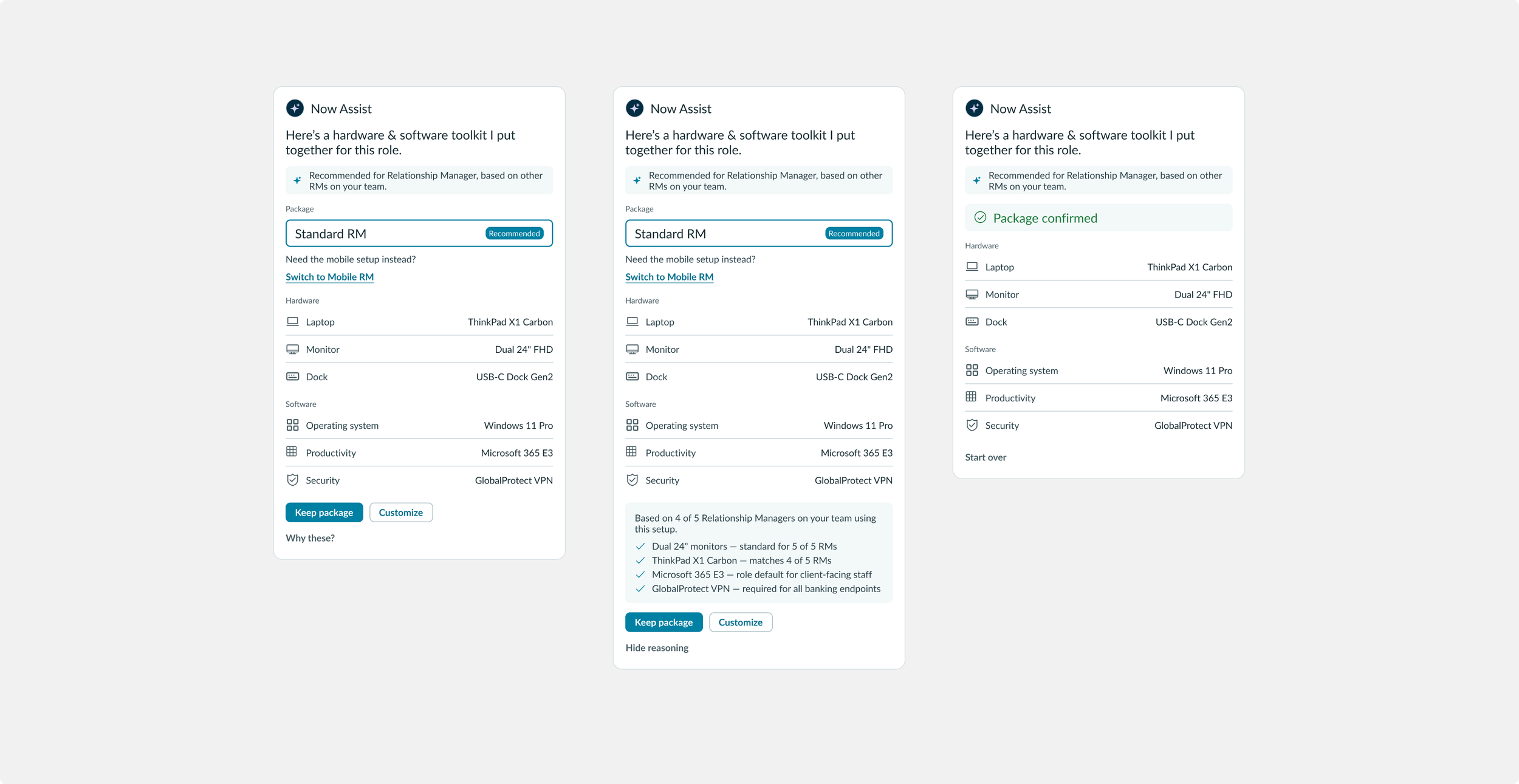
Three states of the card: the recommendation, its reasoning shown on request, and the confirmed package.
Three levels of control. The manager can accept the recommendation in one tap. They can switch the whole package to the mobile setup, and the card marks it as switched from the recommendation and offers a link back. Or they can customise the package and change individual items, with each change tagged and given a revert link. However far they move from the recommendation, it stays visible and reversible, through to a confirmed package.
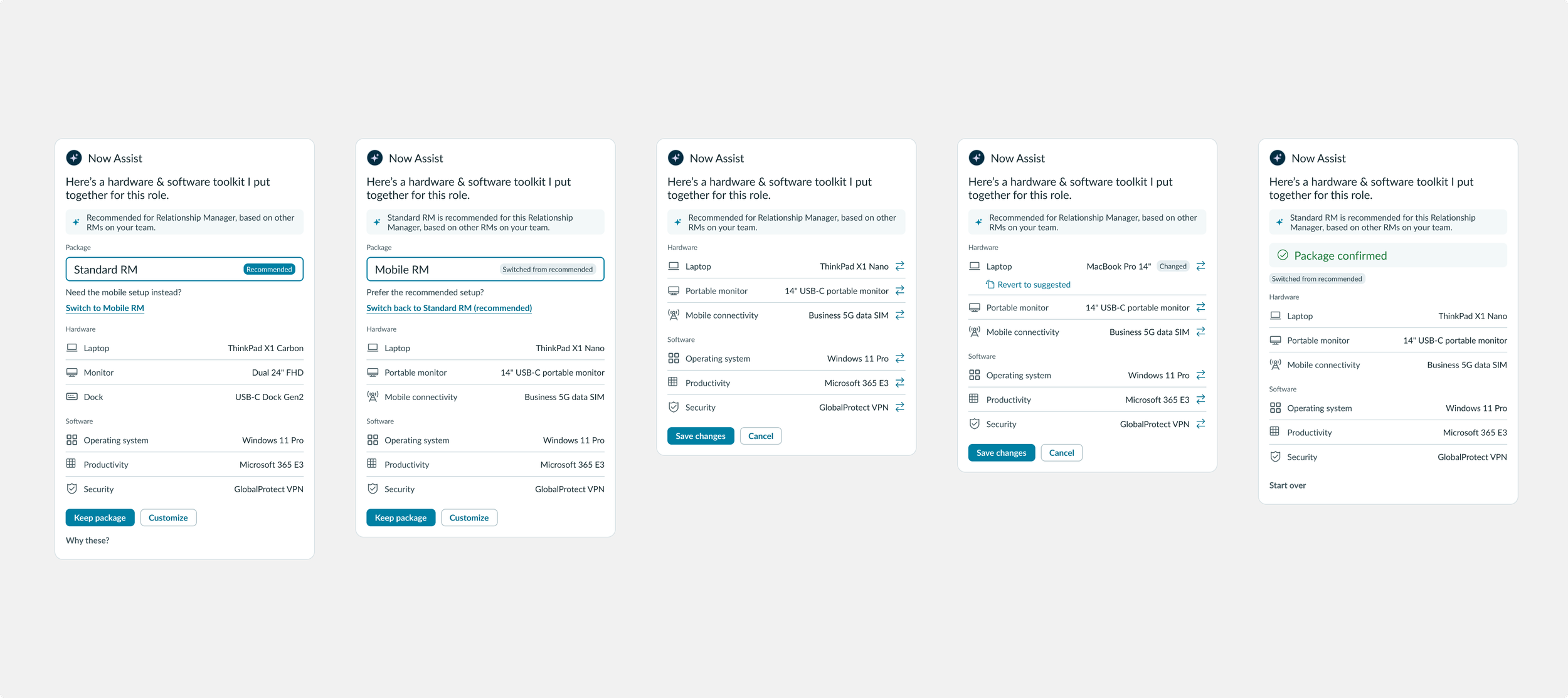
Keeping the recommendation, switching the whole package, or changing individual items. Every change is flagged and can be reverted.
The progress tracker is a display-only panel in the onboarding specialist's workspace. It answers two questions at a glance: how far along the onboarding is, and whether anything is at risk.
Completion is one figure, split into three bars for the groups doing the work: the employee, HR and IT. That way the specialist can see which group to follow up. I considered a single radial ring and parked it, because the split bars also show each group's numbers precisely. Risk is on its own line rather than in the colour of the bars, because bar length and colour already show completion. The line names the group and how serious it is, "IT breaching SLA" or "HR at risk", so it says where to look without needing a legend. Because onboarding runs to a fixed start date, a projected readiness line shows the projected ready date against the actual start date. I designed the panel across all its real states, including empty, loading and error.
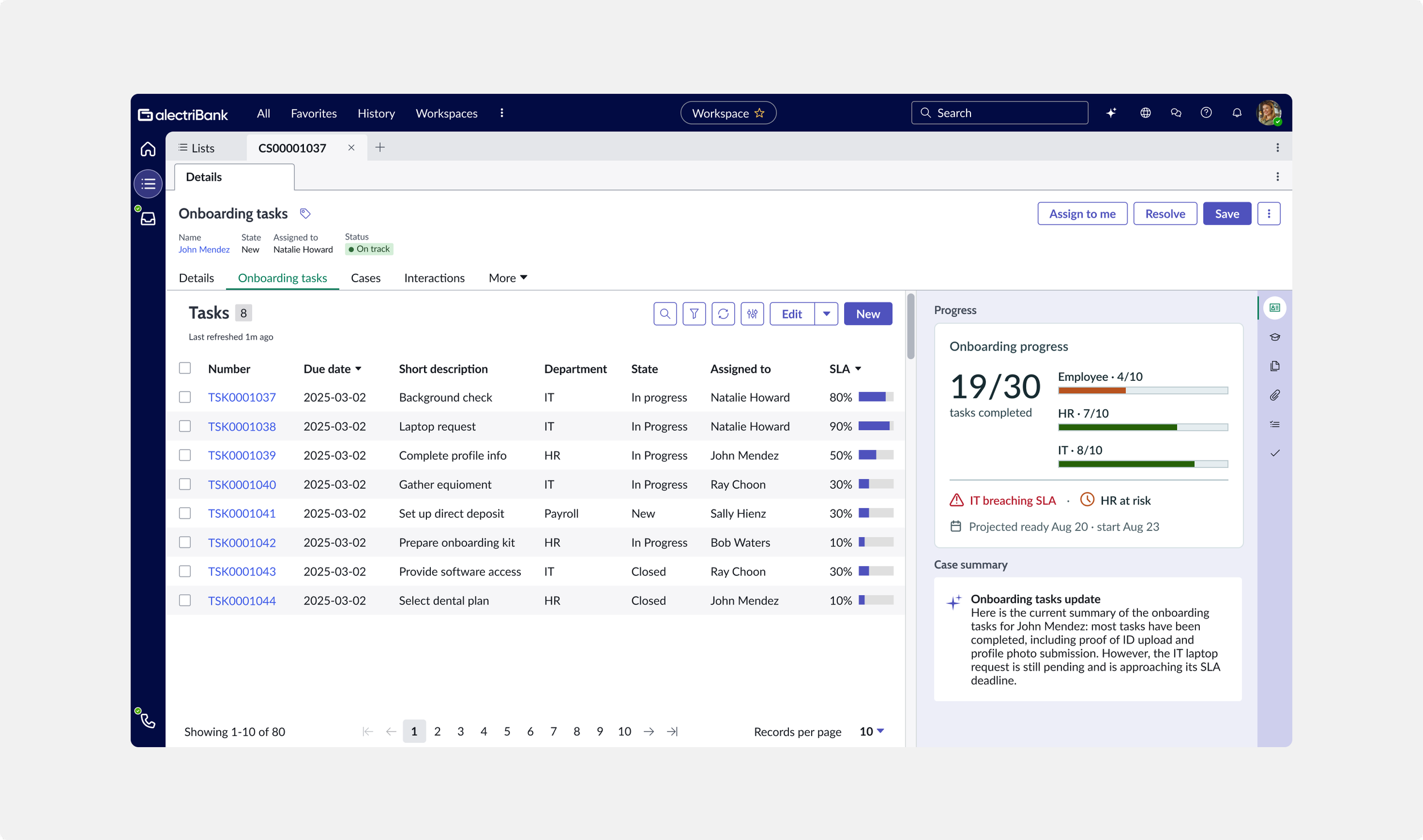
The progress tracker in the onboarding specialist's workspace: how far along the onboarding is, and whether anything is at risk.
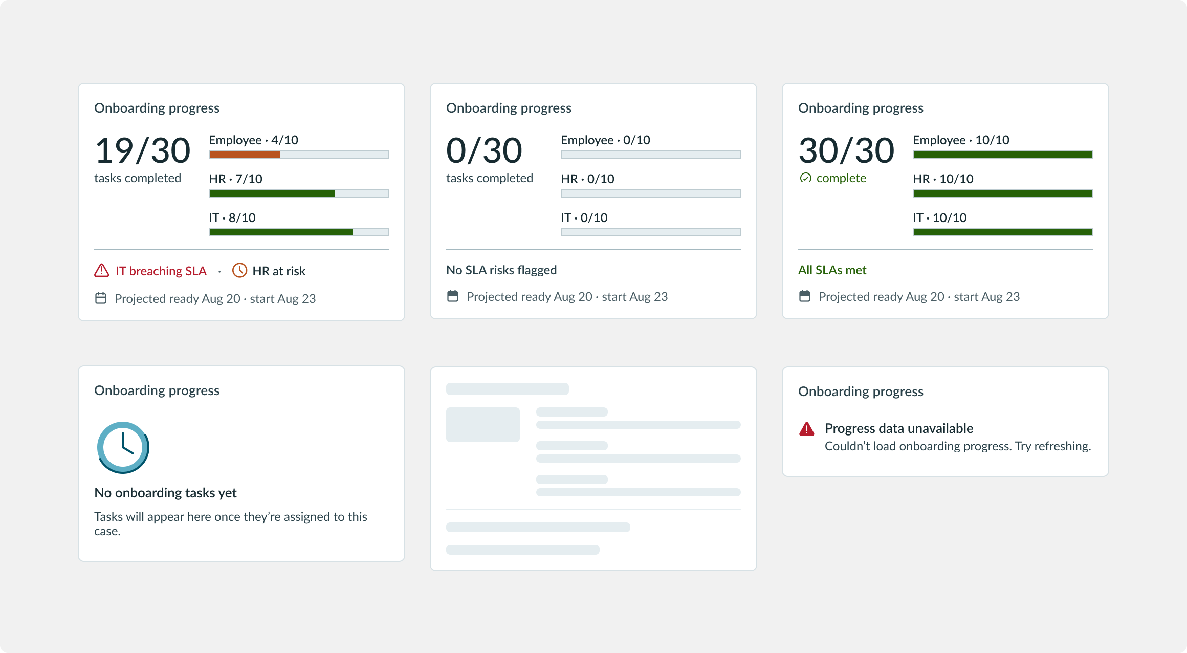
The tracker in its full set of states, including empty, loading and error.
Impact
The solution went into implementation for the customer, and was then packaged as a scoped app made available to other banking customers, which meant the design was general enough to be reused beyond the engagement it was built for. The build included both components I designed. It also passed its internal funding gate and was approved for production, so it wasn't a prototype that stopped at the demo. It was tested with users during the engagement, then resourced and built.
Reflection
The thing I took from this project is that designing for AI agents is as much about restraint as capability. My instinct on the package choice was to give the hiring manager more options, on the assumption that more choice meant more control. Testing showed the opposite: three tiers added work without adding any real say in the outcome, and cutting back to one recommendation and one alternative gave the manager more control, because the decision was quicker. What matters isn't how much an agent can do on its own. It's whether it knows when to act and when to hand the decision back.